
2008-2014 – Urban service stations _ Netherlands


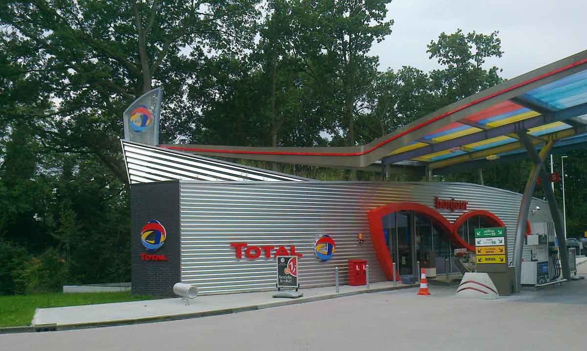
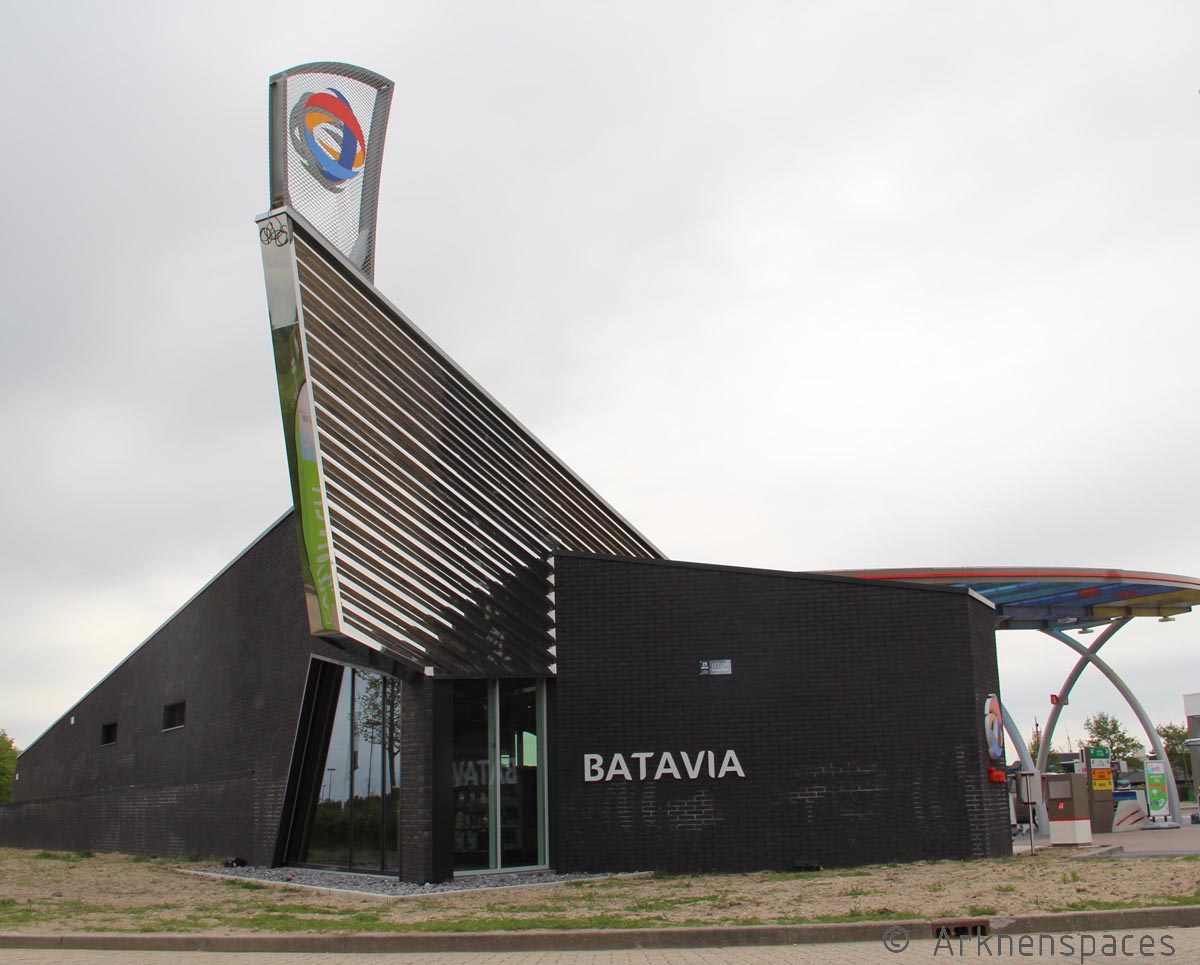
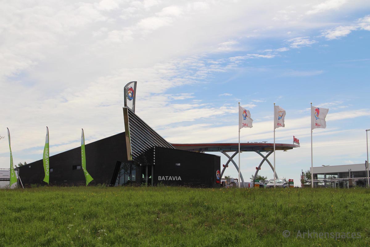
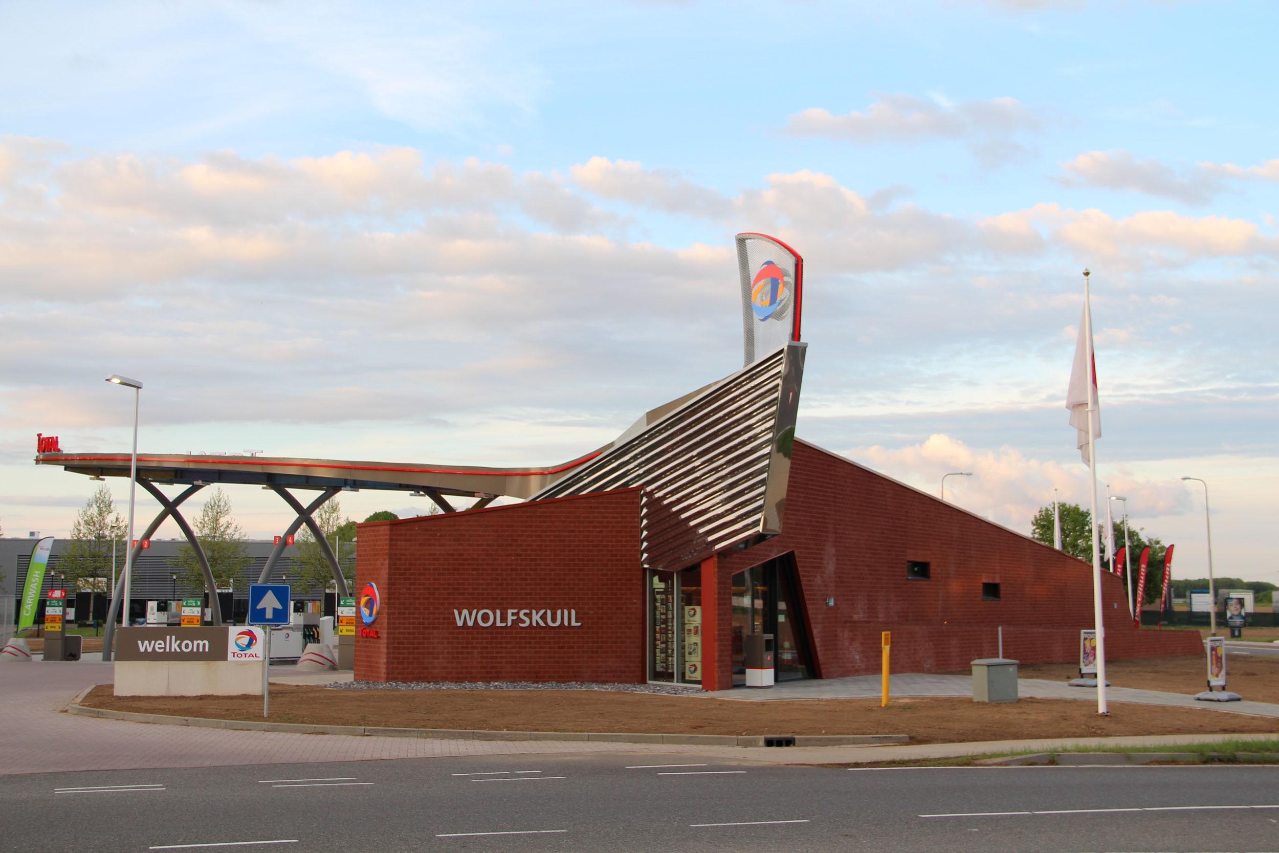
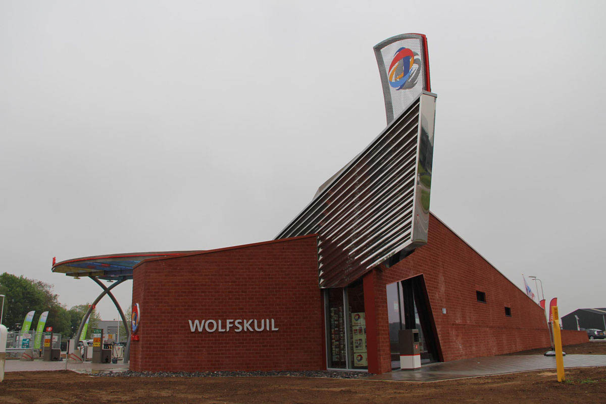
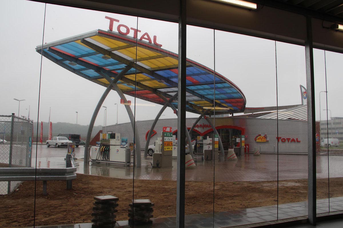
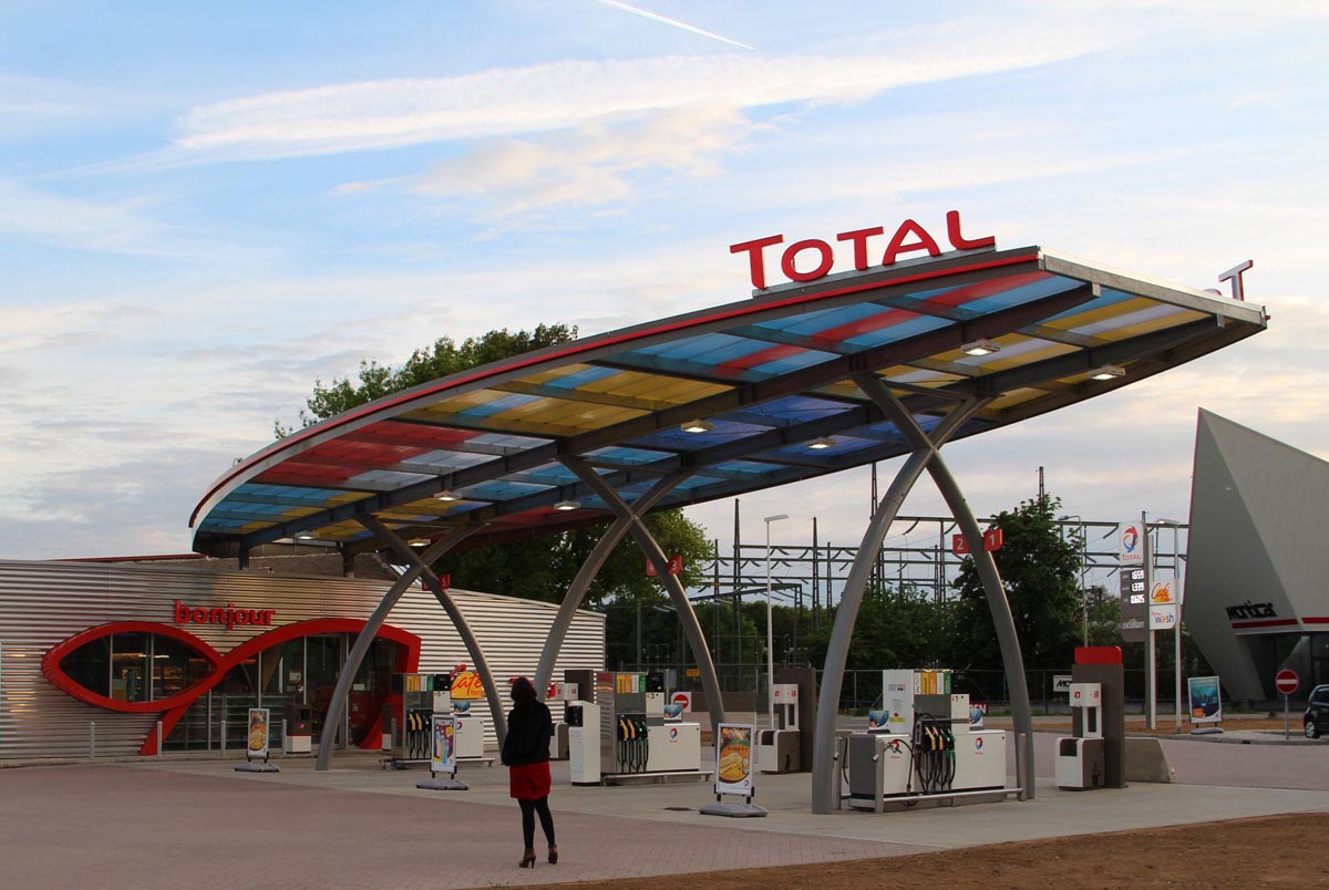
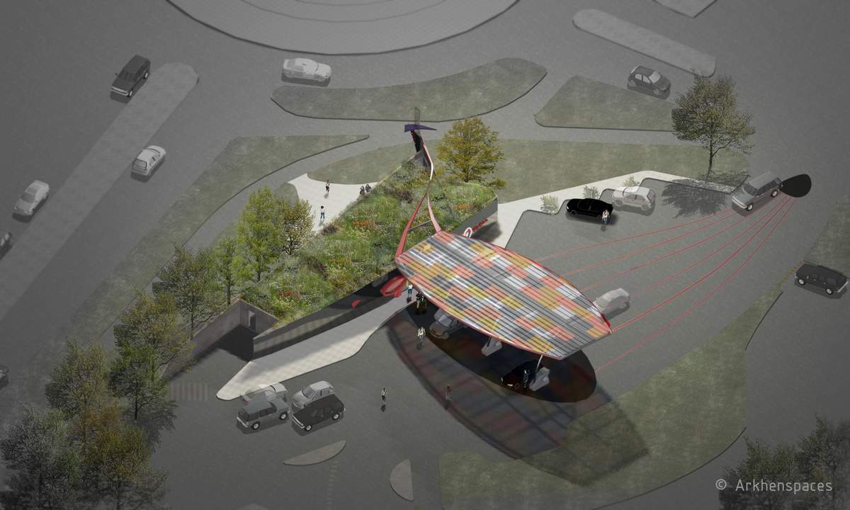
Program New concept of urban service station: 3 constructions in Netherlands, prototype in Herten
Area 180 m²
Place Herten, NL / 2nd station : Lelystad, NL / 3rd station : Bilthoven, NL
Team Éric Cassar, Yacine Touazi, Juvenal Rubinos, Céline Lecoute, Lucie Rieutord
Client Total
Calendar Herten : Studies 2008-2012, building site : 2012-2013
Local ArchitectContrall
General principles The new morphology of this service station opens the building to the city. It becomes therefore a new local business for all users (car drivers, pedestrians…). It participates to the greening of the cities. Architecture takes into account the pedestrian movements, observer that moves around in car or on foot. It reflects a changing aspect of the building depending on the different view angles. It arouses curiosity of all and invites the pedestrians or car divers to discover the place.
The concept:
- Morphology of a «classical» service area:
The service area creats an empty urban space. The shop is only for motorists, for other users this track creates a psychological barrier.
- Morphology of a new urban service area:
The shop alignment with the street is systematized to open the building (shop) to the city, intented for all users.
The service area is not an independent object in the town, it adpats itself to the urban context.
The project
With its new location, but also with the systematic use of new plants, the urban service area is no longer a no man’s land. It is an example of sustainable development (energy saving, water recycling,…) a green enclave adapted to its environment (use of materials on the surronding buildings : concrete, brick, wood, vegetation… It fits in the urban tissu and contributes to the greening of cities.
Links
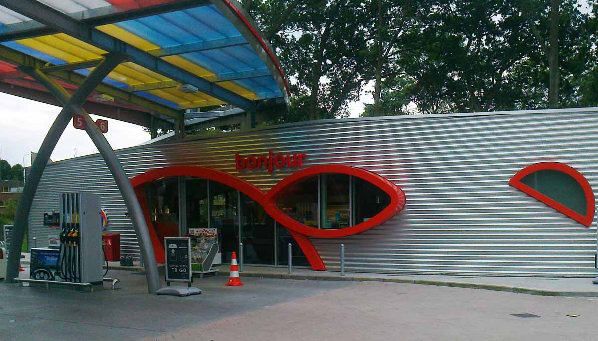
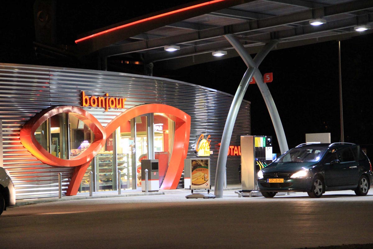
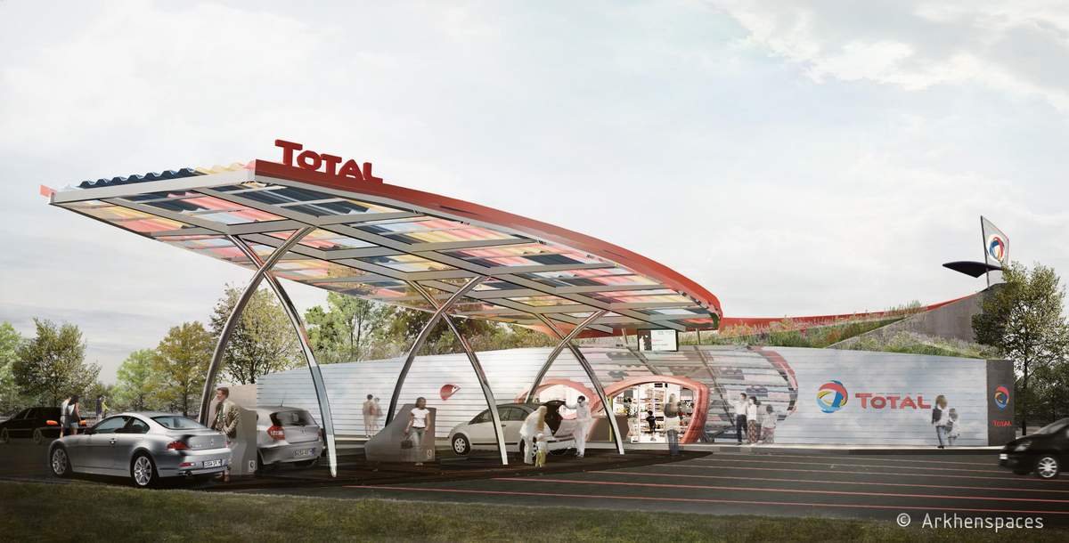
The dual visual connection both on the forecourt and the street offers a quality of light as well as commercial security against theft (the cashier is visible on both sides of the building).
Screens inside the store and outside on the forecourt communicate informations and programs of cultural and sporting events held in the city to customers, while they do refuel. They create a neighborhood social link. This is an extension of the local service offered by the new store’s layout.
Visibility/Readability
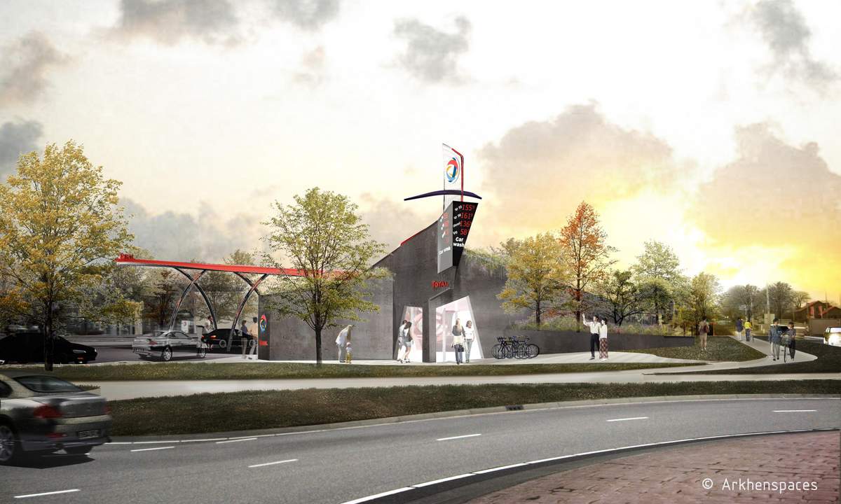
The encounter of the horizontal lines of different volumes results in the emergence of a vertical spire that incorporates totem.
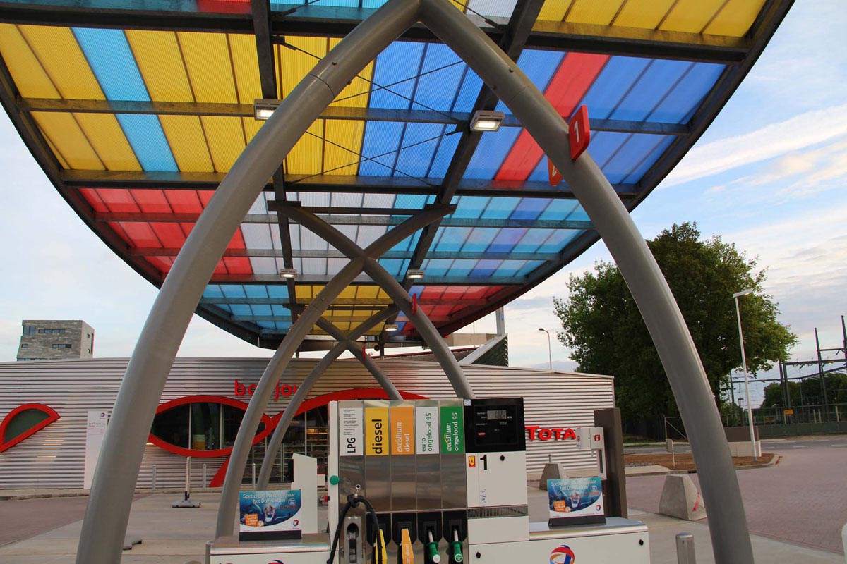
The building is identifiable from afar. The architecture leads motorists look at a center that includes the shop and the totem (recongnition of the function and the brand). A red band creates a link between the track and the street.
At night, the light of the shop and the totem red line identify and point to the service area.
The screen installation in the shop and at the forecourt opens the space area to an additional dimension. These screens offered to the city (which manages the content) provide to customers a local information space : information on cultural events (theater, cinema,…) sports (games) taking place in the area of the district, the municipality. This allows us to reconsider and «improve» the time spent on the area (including filing the tank) while keeping of proximity and community relationship.
Sustainable Development
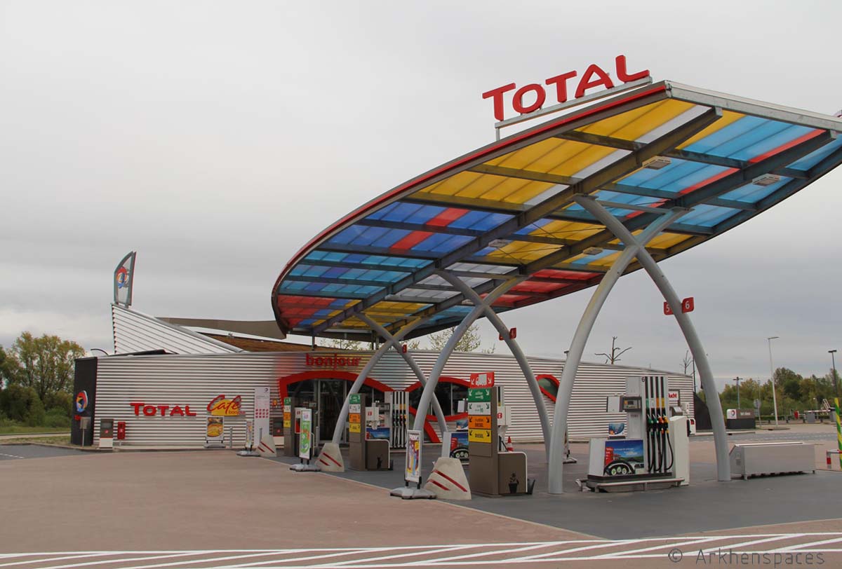
– Solar panel :
Photovoltaic panels double glass are part of the canopy central They are visible from below thanks to the transparent plates. They create a play of light and shadows.
- Water :
The canopy and the building roofs have slopes allowing to save rainwater completly.
- Plant :
The building’s roof is entirely vegetated. In addition to aesthetics, it improves thermal insulation and permits retention of rainwater. All green surfaces are type of «movement garden» (cf.Gilles Clément»). Therefore, it requires few maintenance.
- Light :
The shop has a good natural lighting thanks to its double exposure.